4 Simple Color Rules You Need To Know
When it comes to interior design, one of the most difficult aspects of getting it right is how to properly use color. Hue, tint, tone and shade are essential components of the refraction of light we perceive as color. But there’s no need to delve into the nitty gritty of classical color theory here. Suffice it to say, with so many options and combinations available, it can be hard to know even where to start. Fortunately, artists and designers have been pondering this very subject throughout the ages and have come up with some simple rules that can help even the most hopeless amateur shine like a star when it comes to beautiful, balanced design.
The 60-30-10 rule
Perhaps the most fundamental rule of color design is what’s known as the 60-30-10 rule. Abiding by this rule allows you to achieve the ultimate in visual balance. The premise itself is remarkably simple. As human beings existing in this vast universe, our minds are trained to seek patterns. When it comes to the visual aspect of design, this translates into what we can call balance in repetition. Too much of one element, in this case color, or another leads us to a feeling that things are somehow off and lacking harmony.
That’s where the 60-30-10 rule comes in. First you need to select three colors, depending on your personal aesthetic and taste. 60-30-10 refers to the percentage that each color should appear in a given visual space as in the open kitchen below.
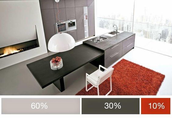 Source: https://www.paintrightcolac.com.au
One of the keys is to select a dominate color that is either neutral or subdued so as not to be overwhelming, unless of course you’re looking for some sort of eclectic 60’s style urban wow factor! This color should take up 60% of the total space.
Your secondary color, which should be slightly bolder (how bold again depends on your personal taste and style), is the 30%.
Finally, your accent color (10%) should be the boldest of all. Whether you’re into pastels or vibrant solids, this is the color that, as they say, really ties the room together.
And there you have it. Balance, harmony and personal style as easy as one, two three.
Warm vs. cool colors
Traditionally, colors have been thought of as either warm or cool depending on where they sit on the color wheel. Vibrant shades such as yellow, orange and red are thought of as “warm”, while shades of purple, green and blue are thought of as “cool”. When it comes to subtler shades, gray is considered on the cool end, while more neutral earth tones such as brown and tan traditionally fall into the warm category.
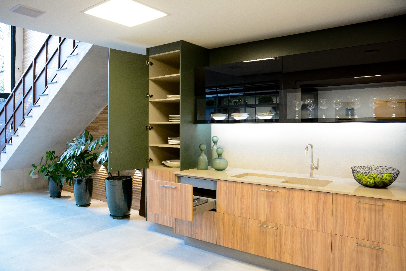
Colors can help define the overall mood as well specific energy of a space. Active places, like children’s rooms, play rooms, and entertainment areas lend themselves naturally to more “active” warm colors. But that doesn’t have to mean vibrant yellow walls or tons of yellow and orange throw pillows. More subtle natural materials such as wood and stone can “warm up” an otherwise cool design, infusing it with both a rustic natural feel as well as a sense of coziness and distinction.
In the example above it’s easy to see how a combination of dark stone counter tops, light wooden floors and ceiling beans and a natural stone hearth around the stove work with red brick paint to create an intimate and incredibly stylish sense of warmth.
Conversely, places such as the bedroom, bathroom and office tend to be more conductive to calmer, cooler colors that exude a sense of tranquility, refinement, and style.
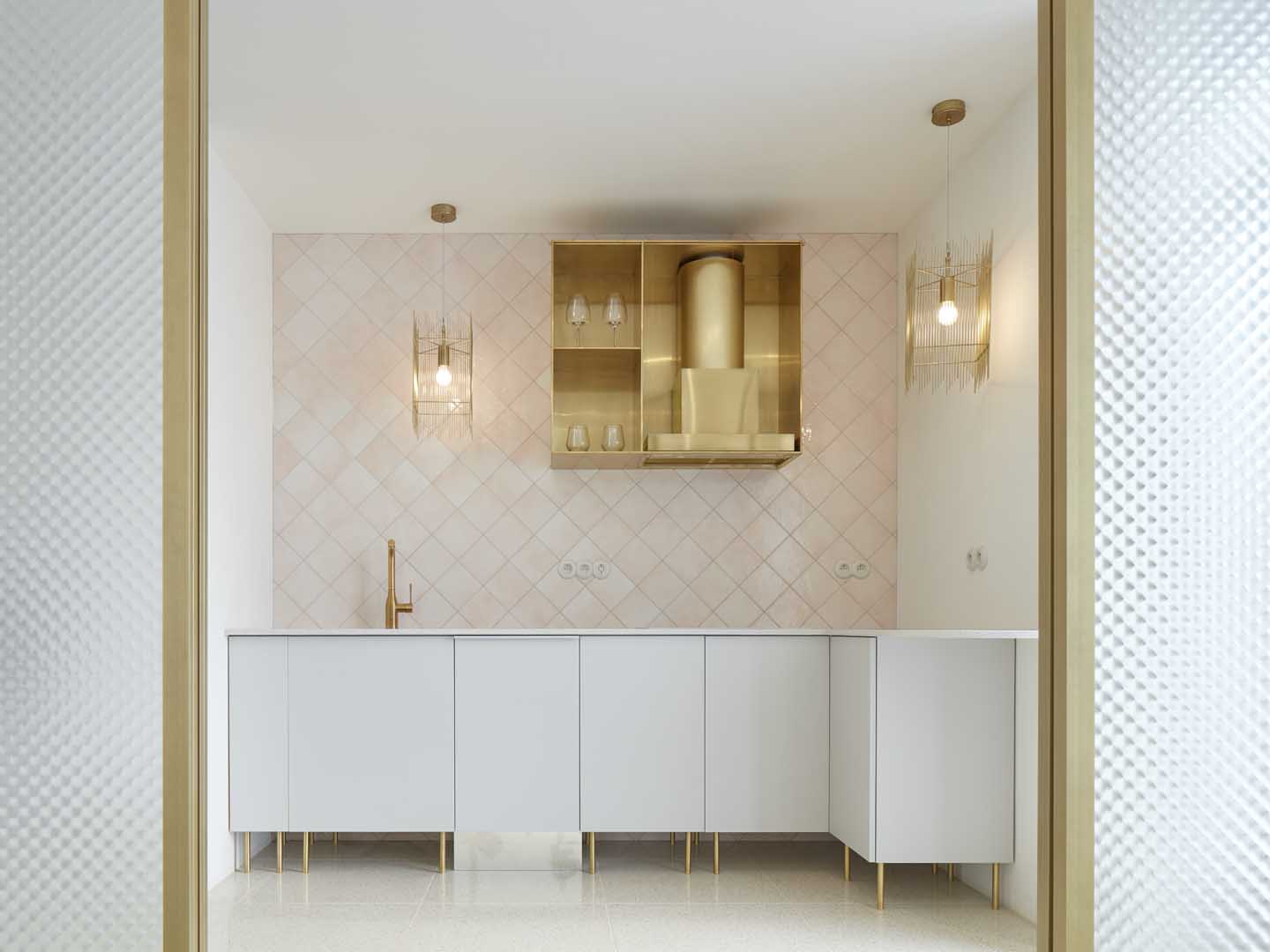
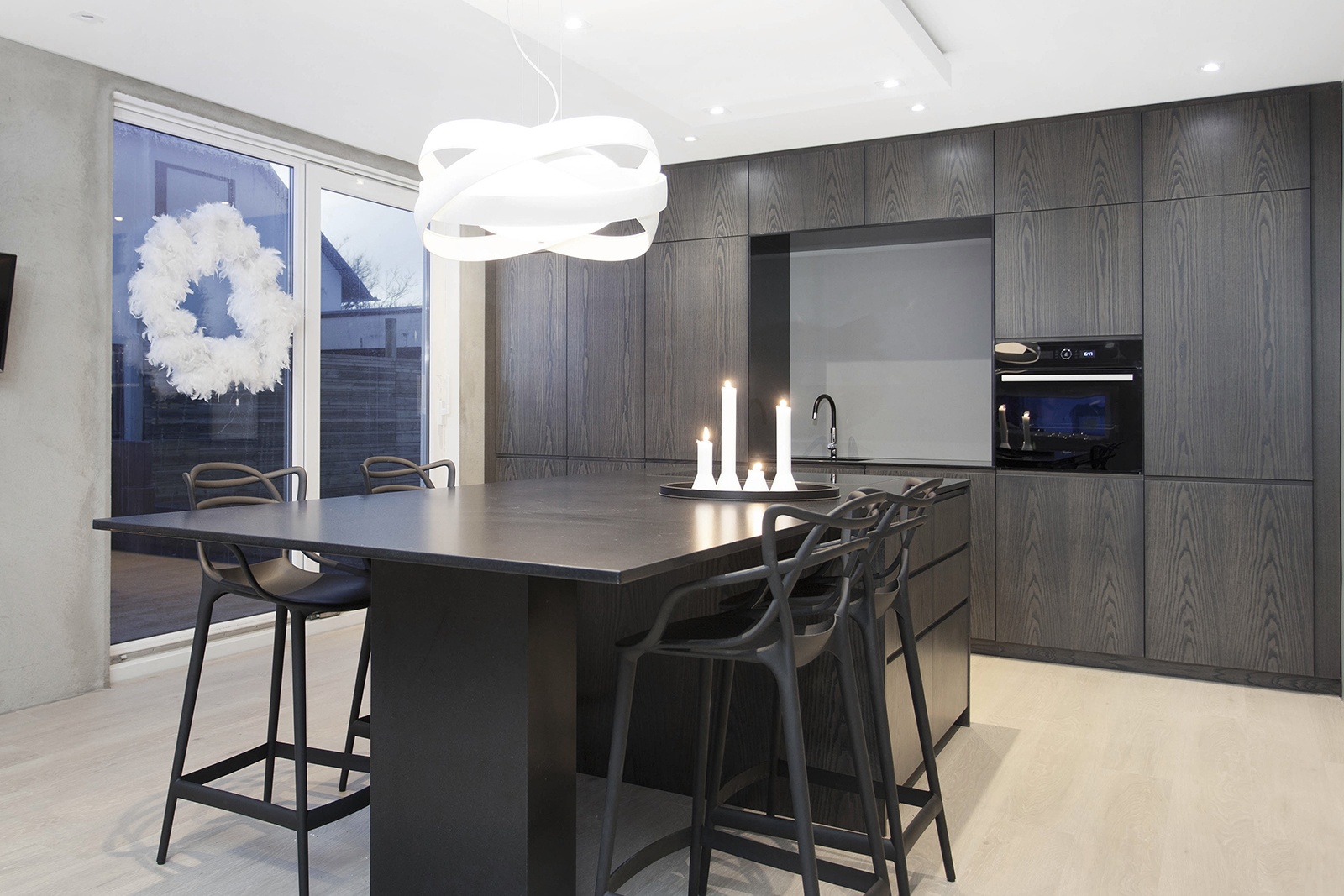
At the same time, even subtle distinctions between warm and cool colors, particularly in combination with direct and indirect lighting, when placed together can work in perfect harmony to create the ultimate sense of beauty in design. Notice how the white marbling of the Technistone® Noble Pietra Grey countertops together with the transparent chairs, warm wooden floors, and overhead lights work in tandem with the neutral white cabinets in this wonderfully refined yet thoroughly contemporary kitchen design.
Complementary colors
In terms of the basic rules applied to color in interior design, perhaps the complimentary color rule is the simplest of all. Complimentary colors are sets of two colors, residing opposite each other on the color wheel that, when mixed, cancel each other out to form a greyscale color such as white or black. Placed next to each other, complimentary colors create the strongest possible visual contrast between the two colors, in effect bringing them to life. For example, red and green, yellow and purple and blue and orange are complimentary colors.
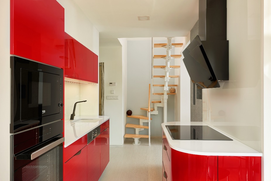
The important thing to keep in in mind when deploying the use of complimentary colors is to use them sparingly. While they tend to bring a great deal of energy into a given space, they are best used is sparing doses, as your accent colors, for example, and should be surrounded with neutrals that both balance the space and direct the eye to the highlights.
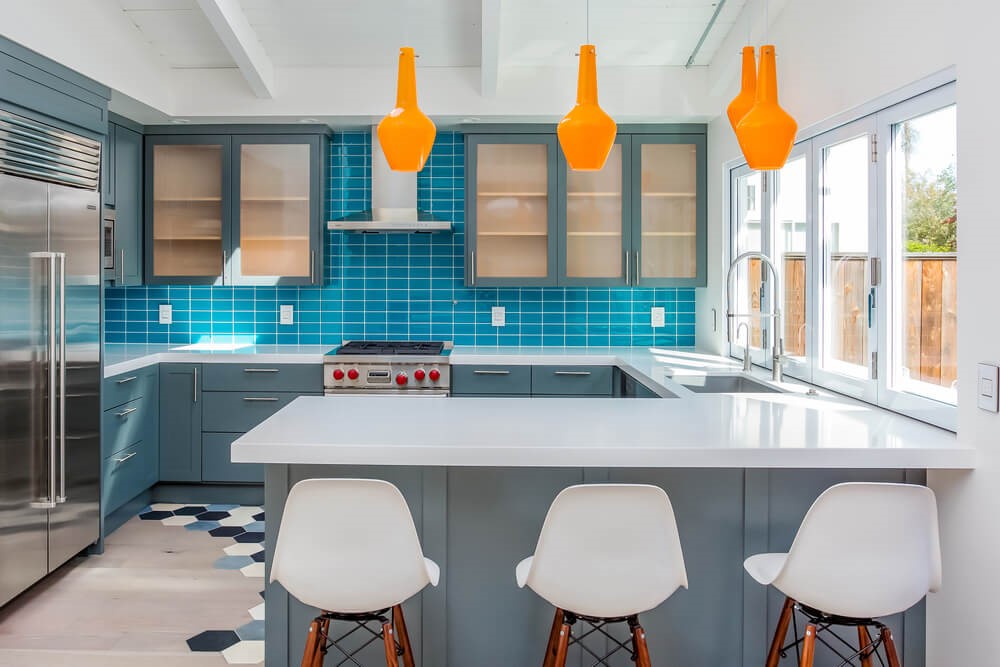
In the example below, you can see how the gentle use of blue and orange in this kitchen design combined with more neutral greys and a sparking stone counter top add a sense of character and playful vibrancy to the space.
Analogous colors
When it comes to the color wheel, navigation is often a difficult art. Luckily, to make things even simpler and stay balanced analogous color schemes are abundant. With this basic color rule, all you need to do is select a core color and then, with a simple glance to either side of it on the color wheel, utilize the neighboring colors as your highlights in various proportions (keep in mind the 60-30-10 rule).
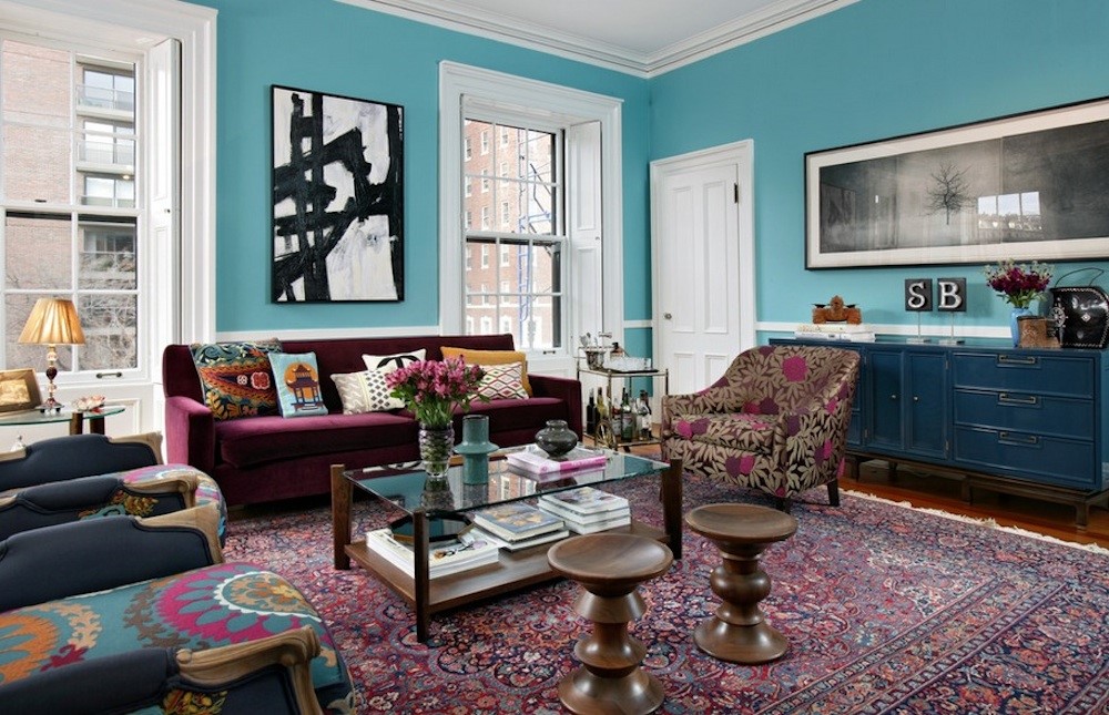
In this wonderfully eclectic example, blue and violet reside next to each other on the color wheel. By combining different shades of each the designer has created at once a lively active space and a space that is well balanced, harmonious and even calm.
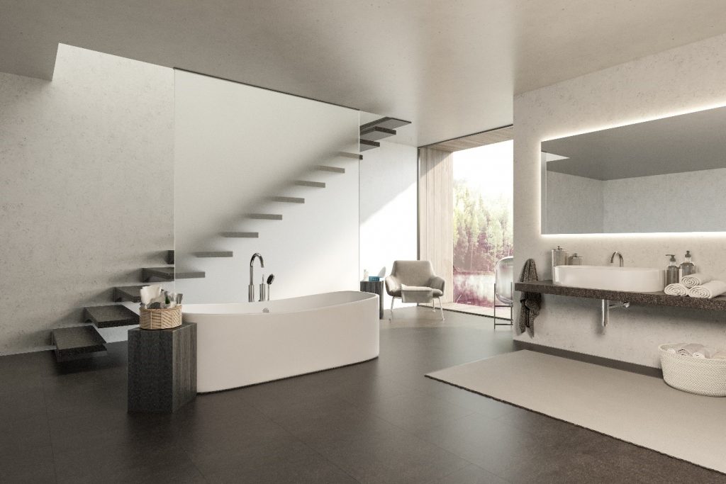
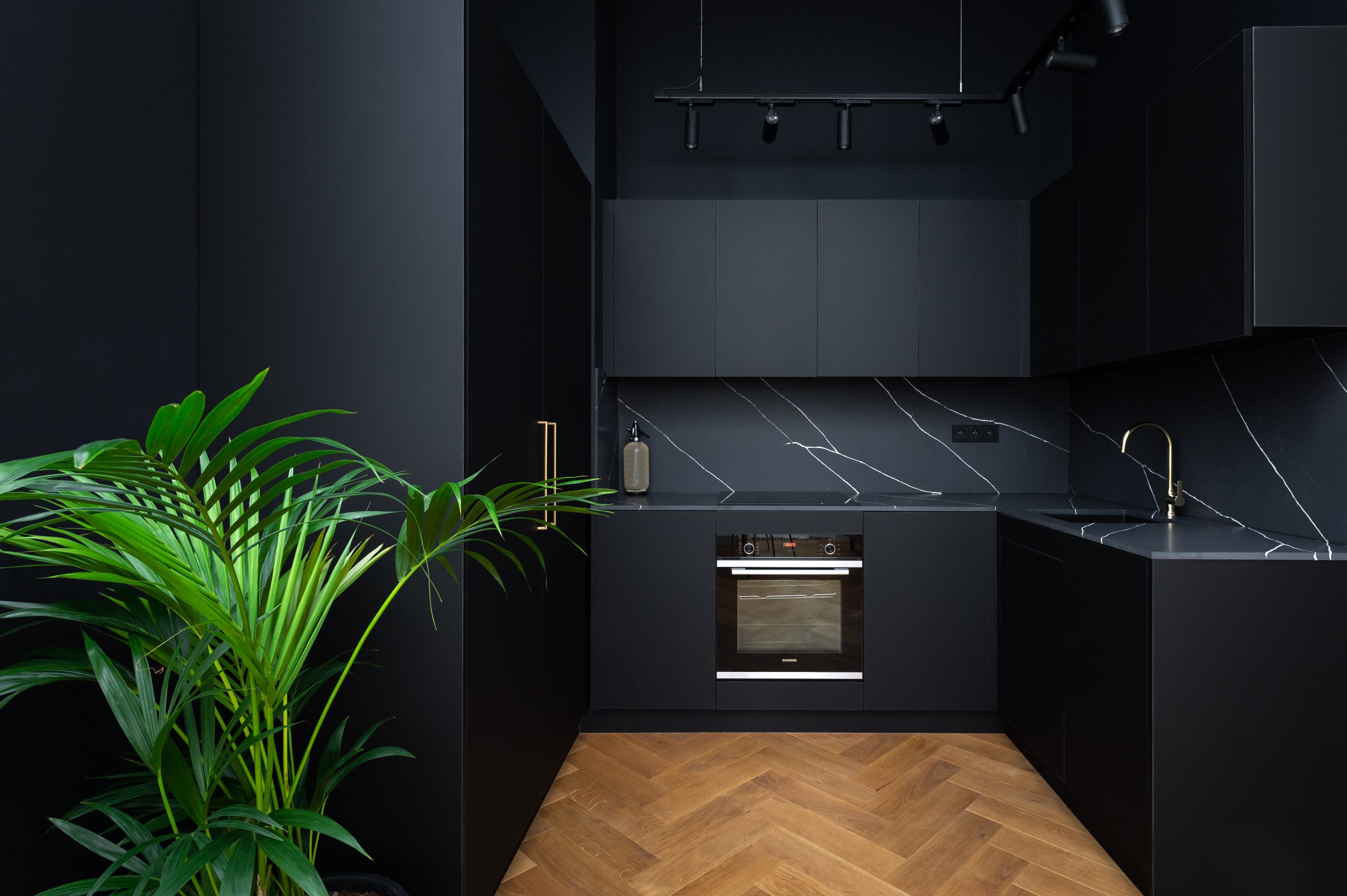
Better yet, you can always use different shades of a single color to infuse your space with visual variety. In terms of black, white and grey, this is referred to as monochrome design, long seen as the ultimate in sleek modern elegance and urban style, as you can see in this bathroom design using Technistone® Noble Arco from a private residence in Oslo, Sweden.
So there you have it. Four basic color rules every aspiring interior designer should know. For more tips on how to approach your interior, inspiration, ideas and trends, stay tuned to Blog4design!


