The Colour of the Year, Very Peri, Finds a Place in Interior Design
The new colour Very Peri is causing quite a stir around the world. This electric purple colour at first glance looked like a rather impractical fad, but after a few months emotions have cooled and the colour of the year has found its way not only into the fashion industry, but also into interior design.
Pantone Has Announced the Colour of the Year for 22 Years
Pantone is an American company that is best known for its colour swatches, each of which has its own defined number. Thanks to that, each colour tone is the same every time. Pantone’s system is a favourite of designers and manufacturers of textiles and plastics.
The firm has announced a colour of the year annually since 2000. Based on the situation in society and an analysis of the trends in various sectors, such as popular vacation destinations and anticipated movie premiers, Pantone’s team of experts predicts the desired colour palette for the coming year. The colour Very Peri reflects the growing popularity of the computer gaming industry with its inclination to the metaverse and virtual reality and its blurring of the digital and real worlds.
Feminine, Powerful, and Futuristic
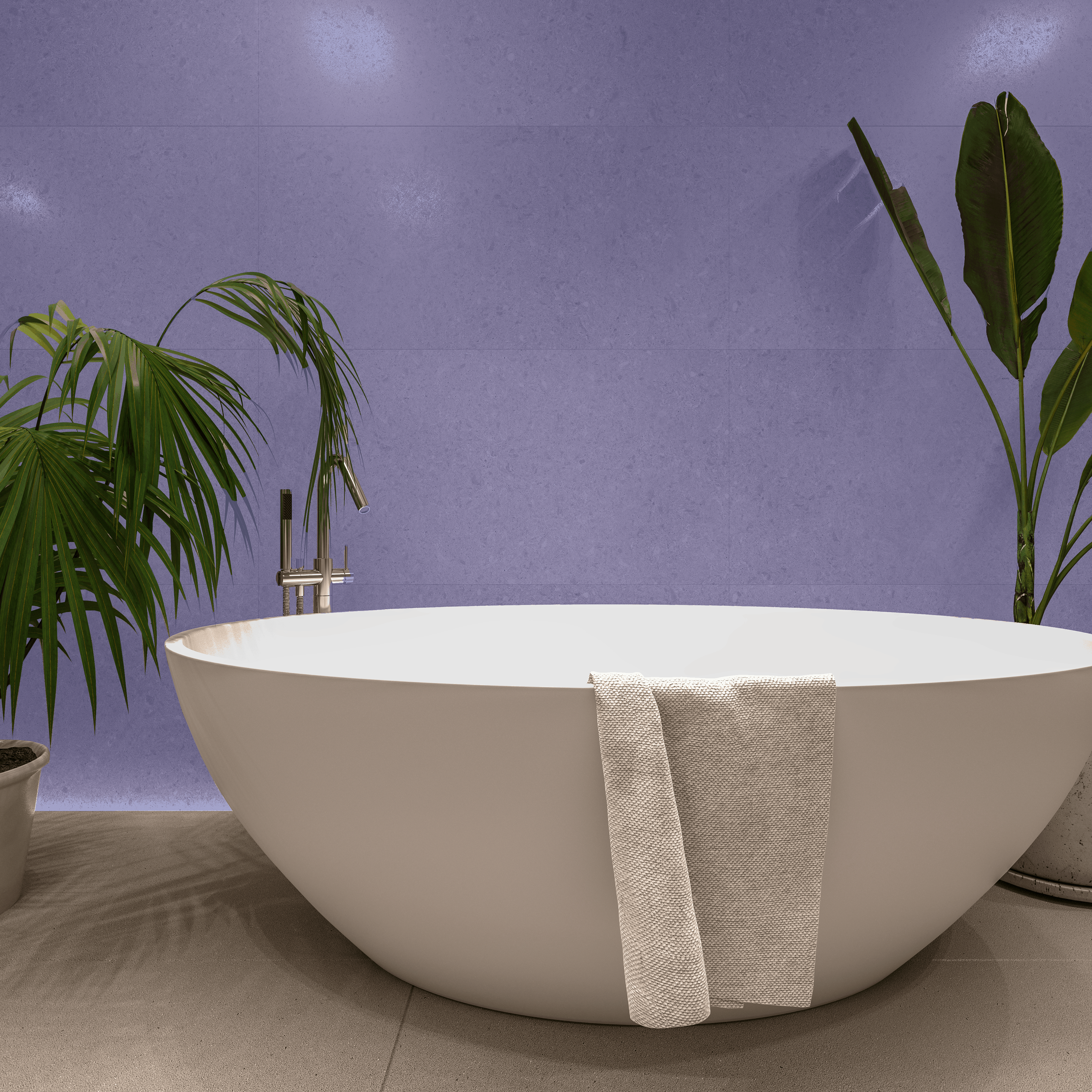
Very Peri is part of the collection of blue tones, but it adds red undertones that push it into the purple spectrum. The combination makes for a sparkling and truly vibrant colour. It is the colour of awakening, that opens up new perspectives after the long years of Covid lockdowns.
Very Peri is a colour not often found in nature, even though it is named for a flower, the periwinkle. We more often encounter it on computer monitors and television screens. It has been popular for some time in digital fashion, whose trends are beginning to cross over into the clothing we wear in real life.
According to Leatrice Eiseman, executive director of the Pantone Color Institute, Very Peri brings playfulness and freshness to interior design. She mentions several possibilities right off the bat for using the colour in an interior.
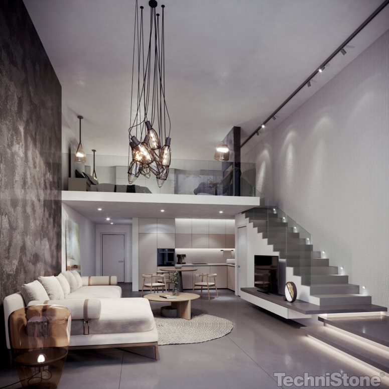
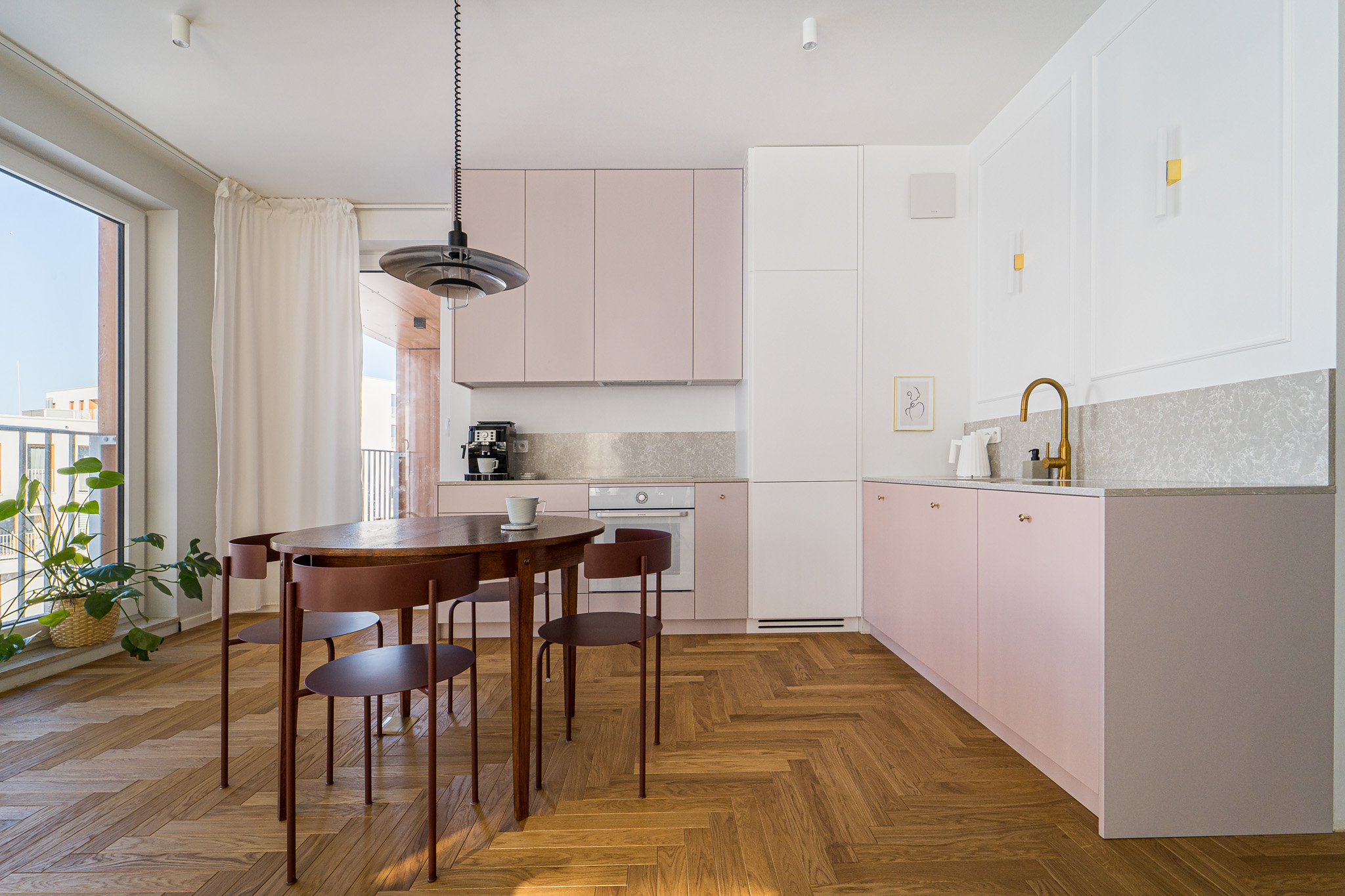
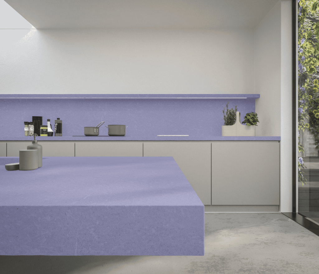
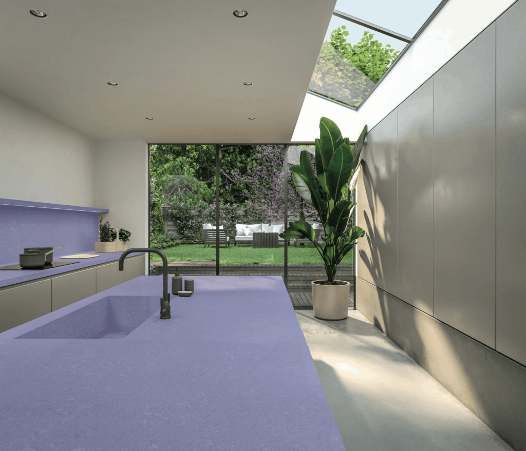
Even if it doesn’t seem likely at first glance, Very Peri fits into a number of interior styles. It will complement an industrial or Scandinavian design, and it won’t get lost in a boho or Japandi interior, either. Nor do we even have to worry about using it in a mountain chalet. It also works well in commercial spaces.
Thanks to its bold colour, it can suit various textures. We take advantage of it in home accessories (vases, glass, porcelain), and in textiles and wallpapers. It also looks good painted on a wall or on distinctive featured pieces of furniture. If we add a few smoky undertones to Very Peri, it can take the place of the popular blue in a kitchen, giving it a futuristic touch.
With What Colours Does It Go Well?
It may be a bit hard to match this colour up with a complementary colour palette. For that reason, the Pantone Color Institute has published other colours of the year for 2022, with which Very Peri coordinates very well. There we find mainly neutral shades of white and grey, but also green and earthy brown. Those colours can conjure up a sophisticated look in an interior that says a lot about an energetic owner who knows what he or she is doing.
Very Peri can also be combined with other shades of purple or pink, and with orange, gold, or silver. Such interiors recall the Memphis Design Style or pop art and can take us back to the 1960s or even to the land through the looking glass.